
ZIKA
A wholistic and global e-learning environment
Motivation
Nelson Mandela once said, " Education is the most powerful tool which you can use to change the world. ". However, around 1.5 billion students in the world were severly affected by closure of schools around the globe due to the pandemic. Education must not stop. Technology has the ability to reinforce the education industry to help navigate these turbulent waters and we, the people, have the will to make it happen.
The Task
Design a robust Learning Management System to enhance the present learning experience and if needbe, have the ability to fully substitute inperson learning. Not only should said system be convenient for the students, it must ease the pressure on the target educational institute and provide just about every service under the sun to seamlessly manage the cohorts.
My Role
Overview
Zika is a wholistic web-based learning tool that is offered both as a product and as a service to complement and simultaneously digitize the in-person learning methodology of a traditional educational institute.
It provides students all the learning resources at their fingertips. These include; class notes and assignments, as well as timetables, newsletters, announcements, grades, notifications and so many more.
On the other hand, for faculty, Zika provides a management system that contains a refined student database and allows teachers to produce transcripts, reports and grade analytics, and to share notes, updates, assignments etc.
What I worked on
As the Product designer, I focused on three main areas:
Strategy
Product features, Product planning, rollout planResearch
Interview with users, both staff and student, prototypes, insights, feedbackDesign
Sketches, wireframes, visual design

GO GREEN!
I created a psuedo-campaign to market a side benefit of implementing Zika which is a reduction of the carbon footprint of the client by going fully paperless.
An average student requires 5 sheets per day which is equal to 1000 sheets per year. For a typical school with 500 students, that translates to 500,000 pages and printing cost of:
$15,000
high level goals
Improve the efficiency of the In-person schooling environment.
Digitize components of the environment to allow students to learn at any time, any place.
Build a management system for admin to use the same technology to manage the school.
Vision for the students
Build a product which enables quick and easy access to all the resources and be well informed with current affairs regarding the school so they can spend their time on what matters most to them and reduce some if not most stress inducing factors.
Vision for the faculty
Build a product that allows seamless teaching experience without the hassle of distributing notes, newsletters, assignments, grades etc.
Design PLAN
A simple plan of action was made to act as a framework upon which the the product would be built.
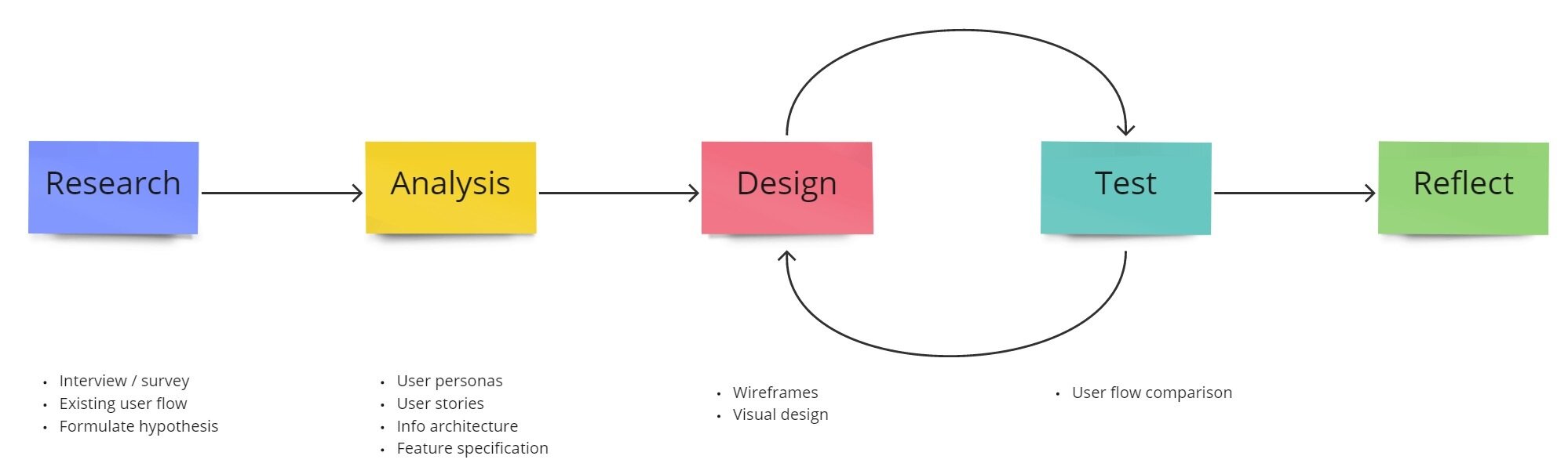

RESEARCH

HYPOTHESIS
Students have multiple responsibilities, like keeping track of deadlines, announcements, submitting homework, checking grades, accessing notes, revising for exams and scheduling their extra curricular activites. Most of these activities are done independantly using different software/in-person techniques and may incur double entry. Therefore, students may find it difficult to retreive a particular piece of information. For example, a student may find it strenous to search through a long list of emails to find a particular announcement or grade report that was sent in the past.
Information Gathering
Surveys and Interviews were conducted on a target audience and insights were gathered pertaining to particular elements of the school experience:
Announcements / Notifications
In-person or physical/verbal communication and Emails are the most commonly used form of communication.
Timetable / Calendar
Written form of calendars and timetables are most commonly used followed by the default organisers available from email providers.
Grades / Notes
Grades and notes are distributed using in-person and email but there are a few users who use 3rd party hosting services to store their notes.
Hypothesis testing
Email and in-person methods of communication dominate in all applications and most users give scores of less than 2 / 5 to the speed and ease by which they can access notes or grades at any given time. The hypothesis is therefore, sound.


Existing User Flow
The current user flow is repetitve and painstakingly redundant. A simple task is made infinitely more complex. For example, it takes 4 clicks and 1 textual search to get to a set of notes from a topic in a subject, then to get the grades for a previous test, the user has to redo the entire process of 4 clicks/search again!

Analysis
All the research data was analysed and elements such as personas, stories and information architecture were created. The desired outcome from this stage was to have a conceptual feature specification for the product. i.e., what exactly does this product do?

User Personas
User personas were made after further analysis on the data collected from the research stage. These personas included typical attributes like micro goals, frustrations and pain points, bio etc.
The personas were used to drive design decisions and architect the product.

User Stories
I need to check the timetable for today
I need to quickly access notes for a subject
I need to check if a teacher finished grading
I need to see if there are any upcoming events
I need to check my grades for a particular subject
I need to see if I have any urgent deadlines
I need to check if I have any fee payments due
Based on the elements above, and after significant brainstorming and analysis, a preliminary IA and feature specification document were created.
Information architecture

Product Documention

A second purpose this document served was as marketing and sales material that can be used to summarize and package the product.
The pricing model was based off of a competitor and market analysis that I performed in 2020. Click on the document to view more pages.
Design
Wireframes

Login page
The first step is authentication, hence a login page is required which contains intuitive input fields, logos and contact information at the bottom. The background is created per the client's preference.
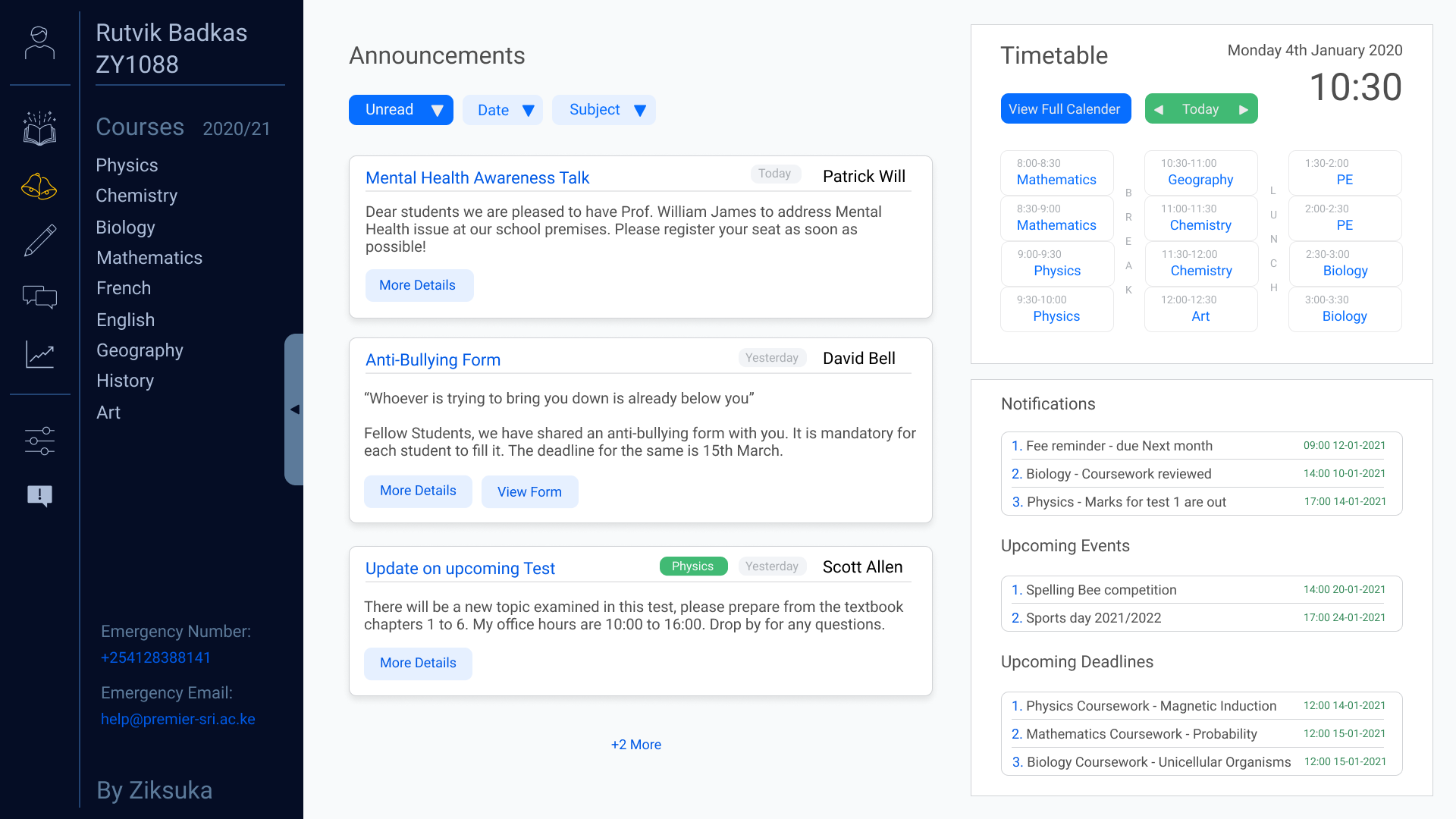
Dashboard/Home page
This is the landing page and serves as a junction to all pages. I addressed the most immediate user requirements here.
According to statistics, most students’ device of choice would be a laptop computer which has varying sizes but a typically resolution of 1920 by 1080 pixels. This is relatively wide hence a smart way to segment is to have a vertical navigation pane on the left and primary workspace on the right. This way, the workspace has a reduction in width hence a longer effective vertical height which enables an efficient content fit with minimal scrolling.
In the Navigation pane, we add links to all subject pages to make them quick to access.

Timetable has expandable elements to provide more information on a particular time slot such as location. A button to change date would make for an efficient way of checking the week’s timetable.
Notifications Grades and Upcoming events are equally important and need to be displayed on the screen. The bottomless nature of this data makes it more suitable for displaying the top 3 most relevant records of each and provide a longer list via a pull down mechanism for quick access.
Announcements should take up a central portion of the screen. Each Announcement has a subject and sender details available for a quick overview at first glance, the details of the content can be viewable by clicking.

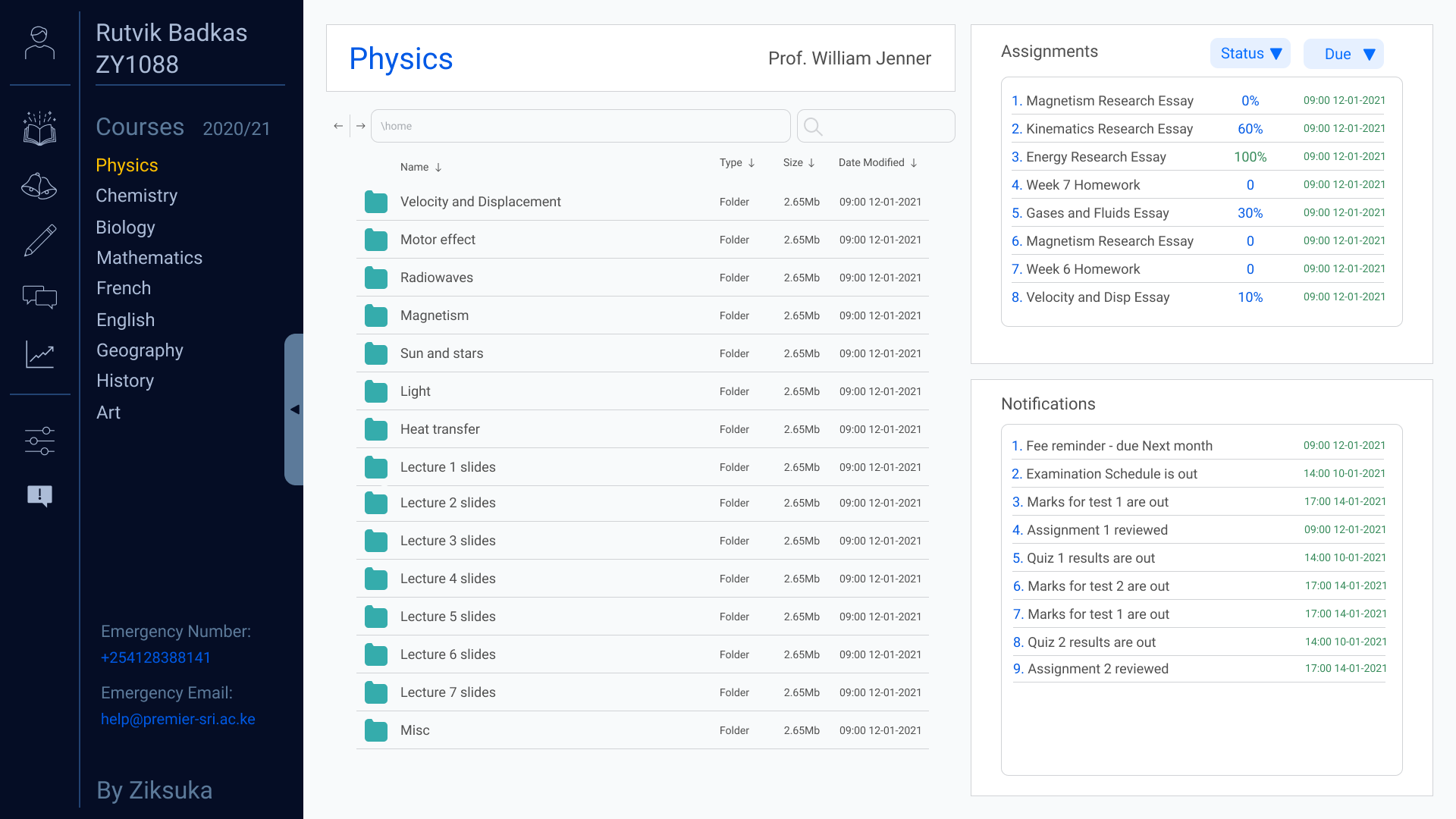
Subject specific pages
As for the subject page, it has resources for students displayed in an organized manner with paths and navigation arrows as well as folders and file sorting functions, similar to windows file explorer in that regard. The page also has key notifications concerning the subject as well as any assignments for that subject. The assignments also have a due date as well as grades and weighting data so that students can sort through and find assignments that are more important/urgent.
Color Scheme
The target client had an existing color scheme that was adorned on uniforms and other tangible constructs. Shown as the two separated colors on the bottom right.
I started by setting up a general color palette based lightly upon the target institute’s existing color scheme. I added darker colors and different shades of neutral greys and a splash of color for the buttons. Majority of the workspace should be grey to not divert attention away from the foreground. Different shades of grey are used for distinctions between pages, boxes, and elements. A blue shade was chosen for the navigation bar to significantly differentiate it from the workspace but at the same time maintain a semblance to the color scheme of the institute. The blue used by the institute is bright and highly saturated hence would draw attention away from the workspace, I solved that by darkening and desaturating the color, and added a blue tint to the fonts and icons in the navigation bar so that it still exerts an overall ‘blue’ theme but maintains a lower profile compared to the blue of the institute.

Typography

Iconography
I designed relatively simple bordered icons to allocate to different tabs to reduce the necessity for titles, saving onscreen real estate. I used a complementary color to add contrast to the highlighted icons and make sure that they are easily legible, said highlighted icons will represent the current page that the user is browsing.

High Fidelity Mockups
These mockups were designed in Figma however stay put for new updates as I believe the cycle of user feedback and revision never stops.

This background with stars was made to symbolize the potential in every student to shine brightly like a star. However, this symbolism can be applied to the sun just as well and an alternative could be a background with the sun shining brightly upon the school under a blue sky that can be doctored to reproduce similar shades of blue as present in the logo.
An additional feature could be an inclusion of a brightly coloured dot besides each time slot in the timetable to represent subjects where an assignment is due, and information can be shown upon hovering.

Notice how an expansion of the displays on the bottom right would allow users to browse through quite a bit of information without having to navigate to a different page.
Can you spot any areas for improvement?
Test

Comparison of User Flow
The new user flow can be compared to the old one. There is a significant reduction in the navigation time as key items are accessible on the home page without even clicking, let alone the 4 clicks + textual search that the old system required. Another advantage is that a user doesn’t need to remember what they are looking for, i.e., they can browse structured lists of all the resources available without having intentionality as opposed to the old system when a user had to know what they were looking for in order to search for it. This means that users are likely to find resources in the new system that they would have otherwise missed. And all this is merely scratching the surface of the benefits this product can bring.
feedback
I would appreciate it if you could take a few minutes and write some feedback or ask any questions. It can be anything, even something as simple as a feeling that you experienced when browsing or a suggestion / improvement.
Alternatively, I welcome you to connect with me directly via the means below.
Phone:
+447432692807
Email:
rutvik239@gmail.com